WP Spritz Speedreader Plugin

Spritz is an easy to use speed-reading tool and one of the most oddly satisfying things I’ve seen developed for blogs.

In short, it is a small frame on your site that allows you to stare at one spot while words whiz by. Your brain can automatically read the words without you needing to scan or scroll. It’s oddly effective and you can reach speeds of 700 words per minute (aka insanity).

When I first discovered Spritz in 2015, the WP Spritz plugin did not exist and I immediately thought to myself: this would awesome if you could simply add it to your website.

I quickly got to work and put together a prototype plugin that would add the Spritz tool to your blog post (top or bottom or even as a floating slide-in) and automatically feed the blog content to it.

It’s a fairly straightforward build and just requires a login to Spritz. I created a simple admin to choose between the 3 styles and followed up with three the_content filters that wrap Spritz around the content itself.

In fact, this was the first plugin I’d ever made. And as such, I did not have enough confidence to submit it for review on WordPress.org.

One day someday I’ll revisit this project and give it a solid rewrite; meanwhile check out Spritz!

Firefly Festival – Website Redesign

Firefly Music Festival is the East Coast’s premier music festival. It brings together over 60k fans and millions in dollars of revenue.

I worked with multiple departments within Red Frog Events to plan, design, build, launch, and actively manage the Firefly website to maximize Ecommerce revenue and deliver the best fan experience possible online.

The WordPress site I built has over 50 custom pages, is viewed by over 1m unique visitors, and includes a custom built user survey platform with over 50k active users.

I personally developed the data structure and page hierarchy for the site to ensure the best possible user experience and navigation flow.

More importantly, I imposed and enforces a strict ban on homepage slider heros – forcing the team to come up with unique and purposeful static hero content.

Firefly has seen happier customers, an easier content management flow, and better user data than ever before.

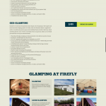
Screenshots

The Dollar Headshot Experiment

Shortly after Christmas of 2016, I met up with some friends to catch up about our lives.

One of my close friends (and eventual groomsman) was describing the eventual downfall of print media and the newspaper he took photos for. I began lightly brainstorming alternatives with him.

Maybe he could freelance? Not ideal because it isn’t super stable work.

Dog photography business? Dogs are tough and never sit still for photos.

Maybe headshots?

We stuck to the idea.

They’re one of the easiest photos to take and one that people typically need updated yearly.

The problem was accessibility and cost.

If you wanted a headshot, you’d need to:

– Schedule time with an expensive professional who may or may not come to you
– Schedule time and drive to Sears or JC Penny for an entry level employee to do it

But what if you could get an inexpensive headshot while you were already dressed up – maybe at a business event or at work.

What if it was so cheap you couldn’t resist? What if it was one dollar?

The Pitch

Dollar Headshot, Co. is a quick, inexpensive, and accessible mobile photography business that brings local photographers to local events in order to capitalize on the large volume of business-centric folks who need a headshot.

The low price point is a no-brainer for them and turnaround time is quick for the photographer. Photo editing, additional file types, print material, productization, and other upsells can all be available for an additional charge.

Furthermore, photographers could license or work for the company at their leisure – providing a stable income for freelance photographers.

Testing the Idea

We decided to test our idea in true agile fashion.

I reached out to a friend of mine that was hosting a startup-oriented meet-up later that month and he happily let us test the business and even added us to the event description & email outreach.

Then, we whipped together a pricing sheet and a Vistaprint banner so attendees could easily find us and see that the business was legitimate instead of a couple dudes with a camera hanging out in a corner.

Event day went awry, as things do.

First problem above all else: I was working on this business from Chicago, instead of New Jersey where the team and event were. Idealism and optimism really floated that dream and I won’t make that mistake again.

Then small things.

The team forgot to bring the sign. And couldn’t find the Square card reader. And needed to pick up a lightbulb for the droplight. And didn’t show up early enough to catch people before the event.

During the event, people were paying attention to the presentation instead of wandering to the booth, which was placed awkwardly out of sight of the attendees.

Before we knew it, the event was over and we had made one dollar. Dollar headshot indeed.

We decided the experiment was a failure despite successfully learning a lot of lessons.

Total investment: 28 days, $150.

Next Time

I do believe the core idea has merit.

Next time, I’ll be sure to be in the same location as my business.

I’ll target more of a networking event, convention, or trade show in order to capitalize on foot traffic instead of a static presentation event.

I’ll bring a big pink sign and require uniforms with name tags.

I’ll stick our bright pink booth in the middle of everything, where no one will be able to miss it and show up before attendees to get a jump start on sales.

I’ll bring sample work, business cards, and practice pitching beforehand.

There’s lots of small improvements to make and maybe some big ones as well. Dollar Headshot, Co. may live again or maybe it’s time to consider working on 99 Cent Headshot, Co. instead.

Warrior Dash – US Map Event Navigation

If you’re not familiar with Warrior Dash, it’s a 5k obstacle course mud run and festival with event locations across the country.

Typically starting in February (in Florida), Warrior Dash moves across the country for one or two-day events until the end of the year.

Ideally, a customer would go on the site and easily see the closest event location to them (which we would later implement).

At the time, the site only showed locations by date and by alphabetical order – there was no easy was to quickly see that there was an event in Maryland or New York without scanning the page for words.

It was not ideal and the page’s bounce rate reflected that.

The Build

The quickest solution was to add a clickable map of the US that highlighted upcoming events.

A visitor could clearly and instantly see that their state was highlighted and click to the event page to learn more and checkout.

Building the map to work with the existing event data was tricky.

The events themselves were handled by a WordPress Custom Post Type that had been extended over the years using the Advanced Custom Fields plugin. Each had a text description of the address, a latitude & longitude, and a state input.

In order to turn around the project in a timely manner, I opted to use a jQuery map library and highlight states instead of pinpointing the exact event location on the map. This had the added benefit of increasing click-thru rates for curious residents and gave the location page a chance to convert users who may have felt far away from the event location.

This left both the address and coordinate fields moot and the state input had been used poorly as a location nickname. In short, I had to add a new field for the coordinator to use for state abbreviation.

Now that events had proper state abbreviations, I appended the information to the pre-existing location HTML elements on the page and used jQuery to fill out the map data. No need to duplicate Database queries!

The map was now at a point where the active states were highlighted in red and the past states in blue – each clickable.

It’s not just pretty, but massively effective as well.

Average time on this page toppled from a whopping 6:25 to merely 25s over 5 months – a reflection that people no longer needed to figure out the page in order to move forward.

Bonus Points: Email List Growth

But what about the other states?

The Warrior Dash team is always looking for supporting data to help them decide to host in a new state.

Using a data structure I had already built for the site’s email marketing platform, Emarsys, I added the inactive state abbreviations to their map links. Then, I created a landing page for these clicks that automatically pre-selected the state in an email signup form.

Users could now easily click their state, land on a signup page with their state selected, and just fill in their email to become part of this “state waitlist”.

The result: a steady uptick of new email signups for inactive states.

Real Estate Evaluation Machine

My favorite book to give as a gift is Rich Dad, Poor Dad by Robert Kiyosaki.

In it, he documents how his early childhood was split between time with his own well-educated father and his best friend’s business-oriented father.

The crux of his book centers around the idea of escaping the rat race – going into educational debt and having a single job – by instead building a business that allows you the freedom to pursue your life.

In his case, real estate was the means. He outlines a few techniques he used and goes further to educate about it other books, course, seminars, and trainings I’m sure.

I have not read those books, bought those courses, attended those seminars, nor paid for training; but the idea stuck.

Real estate.

I dove deep into it: reading articles, scrolling through forums, downloading ebooks, listening to audiobooks, attending webinars, buying books, filtering listings, checking crime maps, and even paying to join my local real estate investing (REI) group.

I absolutely loved it. I’d long lived in the tech bubble of virtual passive income and this was my first real consideration and analysis of a physical market. I could actually touch my investment and work with my own two hands to improve it.

It all made perfect sense to me.

Naturally, there are a thousand different ways to pursue it.

Buy. Rehab. Flip. Hold. Wholesale. Lease. Sell. Rent. Sublease. Services. Etc.

Through learning about them all, I found that the simple buy-hold-rent approach fit me the best. Not only was it simple and uncomplicated, but it provided long-term equity and stable income where methods like flipping or wholesaling did not.

I went on to begin looking at properties on Redfin, Zillow, and Trulia. Shortly thereafter, I became inundated with organizing calculations.

First, it started with just plugging numbers into a calculator. It was easy to lose track of my place and I had to restart if I wanted to tweak assumptions.

Then, I tried to use Google Sheets. Though I’m a big fan of the technology and color coding, it just left something to be desired as my properties kept piling up as tabs or as rows.

Finally, I looked into using Bigger Pockets calculator. It allowed me to follow easy steps to fill out my assumptions and I could easily change my answers, but I wasn’t at a place I could justify purchasing the subscription needed to actually use the product on multiple properties.

Instead of purchasing a subscription, I did what any product developer would do: I made my own.

The DIY Real Estate Evaluation Machine

In just over a weekend, I built out my own calculator to aid in my research. I called it Real Estate Evaluation Machine (REEM) and published it as wiserdollars.com.

Where Bigger Pockets’ created a calculator that allows you to run a single property’s evaluation, I build a platform that allows you to add unlimited evaluations to a property.

For example:

Say you find a triplex up town a few blocks from the train stop.

You think: “Ok, I could get traditional financing, put 20% down, and rent all three units at x dollars per month.”

But then your wife asks you to consider moving into one of the units.

And then you think about putting 30% down or pursuing hard money to cover the down payment.

You wonder if you could flip it or even rent the units on AirBNB.

The Solution

With REEM, you can attach each of these scenarios to that property and easily view how they compare to one another.

You can see that the 3-rental scenario actually provides a lower rental income compared to listing on AirBNB. To your surprise, the hard-money loan only makes sense if you flip in 2 months, but can actually provide more net revenue than buy-and-hold.

Though it’s not perfect, REEM provides me the ability to see if a property is truly worth doing the math on. And the best part of it all: I can add new features as I see fit.

So go check it out and let me know how I can improve it!

Specs:

Laravel 5 (PHP) deployed on Digital Ocean

Things I’m proud of:

  • Giving the user the ability to create unlimited editable properties with unlimited editable evaluations.
  • Using a three-column meta table to house every variable of an evaluation instead of creating dozens of null columns in the evaluation table.
  • Deleting a property or evaluation deletes the associated data recursively.

Potential:

  • Subscription or pay-per-use monetization
  • Multiple evaluation types: AirBNB, Flip, etc.
  • Generated graphs of profitability over time
  • Additional calculators

Though I’m still building out the product, the fully functional public beta is published and waiting for your use – absolutely free (for now).

If you’re interested in the project, feel free to comment below or contact me to get involved.

Project REFSBO

In the same light that I built REEM, I had an idea to build a lead generating machine to capture people looking to sell their homes in order to either make a deal with them or pass along the lead to one or multiple real estate investors (REIs) for a finder’s fee.

The idea started out simple: build a landing page for a specific town/neighborhood with a simple contact form capture. The copy would position it so that users would specifically want to connect with fast-buying REIs.

I could then sell leads by quantity to local neighborhood specialists and even cause a bidding war. Though REIs prefer exclusive leads, users want to connect with multiple options so they could have a better chance at closing a deal.

This is the base outline for any lead generation engine.

But Then I Thought About It

However, I let the idea stir in my head for a while.

Eventually, a single question stood out:

“Where can I go to find a list of people who specialize in buying homes in my neighborhood?”

Why could I, as a home-seller, not take direct action in contacting people who were known to buy properties in my area?

Why did I have to rely on networks and listings and brokers and agents?

Could I not call Steve Johnson, who has a history of buying properties like mine, and try to make a deal directly with him?

Project REFSBO

So, this idea of a “directory” of REIs was born – Real Estate For Sale By Owner (REFSBO).

First and foremost, REIs could register an account and fill out a profile of who they were and the properties that they specialized in buying. They could list price range, home types, neighborhoods, contact info, and even history of deals. This is the core of the product.

From there, home-sellers could peruse and filter profiles to the ones that best fit the description of their home and directly contact the deal-maker himself.

Someone selling a 3 bedroom townhouse in Lakeview would be thrilled to find Steve Johnson, who specialized in buying townhouses in Lakeview and whose last 4 deals were 3 bedrooms.

A win-win: the home-seller finds their best chance and REIs have leads contact them directly.

From there, featured listings, pro features, and even pay-per contact are all ways to monetize off REIs.

I haven’t found the time yet to build a prototype, though I’d expect it would only take a weekend.

Comment below or contact me if you’re interested in the project!