Warrior Dash – US Map Event Navigation

If you’re not familiar with Warrior Dash, it’s a 5k obstacle course mud run and festival with event locations across the country.

Typically starting in February (in Florida), Warrior Dash moves across the country for one or two-day events until the end of the year.

Ideally, a customer would go on the site and easily see the closest event location to them (which we would later implement).

At the time, the site only showed locations by date and by alphabetical order – there was no easy was to quickly see that there was an event in Maryland or New York without scanning the page for words.

It was not ideal and the page’s bounce rate reflected that.

The Build

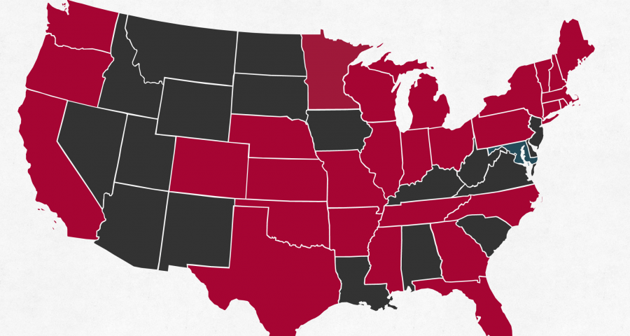
The quickest solution was to add a clickable map of the US that highlighted upcoming events.

A visitor could clearly and instantly see that their state was highlighted and click to the event page to learn more and checkout.

Building the map to work with the existing event data was tricky.

The events themselves were handled by a WordPress Custom Post Type that had been extended over the years using the Advanced Custom Fields plugin. Each had a text description of the address, a latitude & longitude, and a state input.

In order to turn around the project in a timely manner, I opted to use a jQuery map library and highlight states instead of pinpointing the exact event location on the map. This had the added benefit of increasing click-thru rates for curious residents and gave the location page a chance to convert users who may have felt far away from the event location.

This left both the address and coordinate fields moot and the state input had been used poorly as a location nickname. In short, I had to add a new field for the coordinator to use for state abbreviation.

Now that events had proper state abbreviations, I appended the information to the pre-existing location HTML elements on the page and used jQuery to fill out the map data. No need to duplicate Database queries!

The map was now at a point where the active states were highlighted in red and the past states in blue – each clickable.

It’s not just pretty, but massively effective as well.

Average time on this page toppled from a whopping 6:25 to merely 25s over 5 months – a reflection that people no longer needed to figure out the page in order to move forward.

Bonus Points: Email List Growth

But what about the other states?

The Warrior Dash team is always looking for supporting data to help them decide to host in a new state.

Using a data structure I had already built for the site’s email marketing platform, Emarsys, I added the inactive state abbreviations to their map links. Then, I created a landing page for these clicks that automatically pre-selected the state in an email signup form.

Users could now easily click their state, land on a signup page with their state selected, and just fill in their email to become part of this “state waitlist”.

The result: a steady uptick of new email signups for inactive states.

Warrior Dash – Analytics

Like any site, Warrior Dash had Google Analytics installed and running in the background.

Once in a while, various members of the team would poke around in GA in order to gleam high level details like gender or mobile usage.

But these single metrics don’t really give the whole picture – especially when half the funnel is not being tracked at all.

Questions remained:

  • How many people clicked to the checkout?
  • Where did people drop off along the checkout process?
  • How far do people really scroll on these pages?
  • Which demographics tended to purchase which products?
  • Did any channels in particular tend to lead to more sales?

Answering these questions could lead to specific actionable steps the team could take to improve sales and maximize advertising costs; a much bigger impact than perusing total sessions and site bounce rate.

Adding Proper Views

First things first, I split the single All Web Site Data view into three different views.

Since the All Web Site Data view already had IP filters on it, I renamed it to Master View. This would be the primary view the team would use to view their data.

Second, I created a true All Web Site Data view with all filters removed. This acts as a backup of site data in case we need to view raw results.

Lastly, I added a Test View that would be used to try out new dashboards, segments, filters, goals, or funnels. It’s important to have a test view so you don’t impact your Master View unless you’re sure you’ve done things right.

Ecommerce Funnel Tracking

Next up, we needed to start tracking what happened when we sent people to checkout. Warrior Dash checkout was on a different platform than the website itself, so not only did we need to add our code to it, but we needed to make sure Google Analytics would be able to track a visitor across both domains.

This is called cross-domain tracking and unfortunately, Google doesn’t handle it out of the box. You would assume that since the same tracking code appears on two sites, it would naturally link the two, but instead GA will treat them both as referral traffic and throw your data and assumptions in a big way.

On top of this, the Ecommerce platform used on-page popups to guide users through the checkout flow instead of simple pages. Since Google Analytics only tracks new page views by default, we needed to add event tracking to the cart process so we could see where people dropped off as well as advanced ecommerce tracking to the products themselves to gleam insight into purchases made.

So, I worked with the Ecommerce development team to implement cross-domain tracking, advanced ecommerce tracking, and event tracking throughout their cart funnel.

Scroll Tracking

On top of that, I added scroll tracking to key pages to gain better insight into which sections of these pages visitors actually saw.

This way, the team could better understand which information was being consumed before users either exited the page or continued to the cart and ultimately decide on how to best proceed with organizing these sections.

Better Reporting

Now, it’s nice that all of this data is being properly collected in Google Analytics, but what does that mean for non-techies?

Wouldn’t it be great if key insights were pre-analyzed and available on a convenient dashboard?

Well, the Warrior Dash team is in luck! Google Analytics offers custom dashboards to view key metrics in an easily-digestible way.

They can now see total sales volume per channel, view revenue by demographic, and check mobile cart abandons all in one convenient location – now that’s better reporting.