Skinny Ms. Website

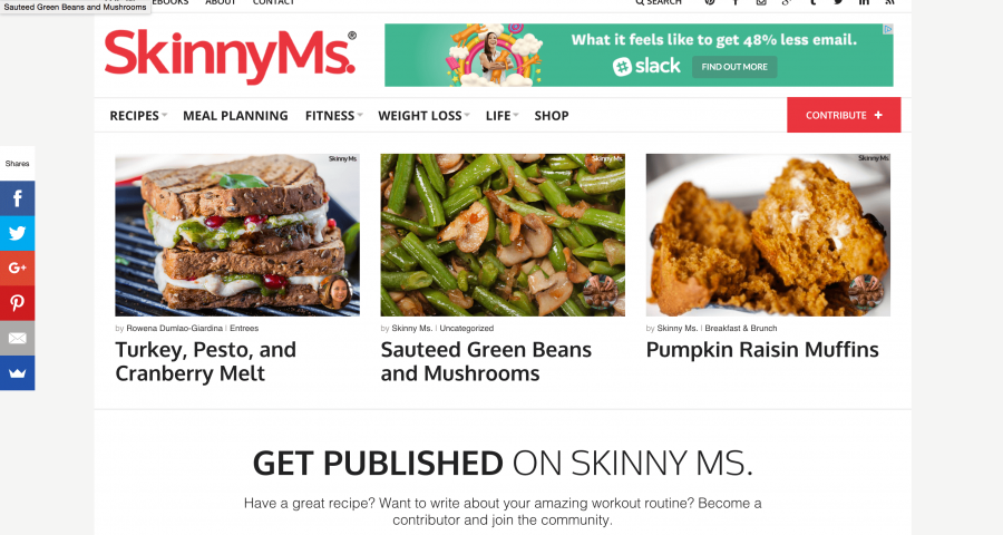
SkinnyMs.com is a large online publication dedicated to providing healthy recipes, weight loss tips, and fitness routines to women across the globe.

Their content is seen by nearly two million visitors every month and they’ve been featured in Glamour, Today, Cooking Light, The Huffington Post, Yummly, MSN, and many more.

I was tasked with designing a responsive website that would showcase their content, improve the user experience, and promote their new contributor program.

SkinnMs-stage

My Approach

Looking to evolve from their outdated website, SkinnyMs. came to me in order to capture the essence of their brand. I focused on giving their content room to breath with a heavy emphasis on whitespace and minimalism.

Showcase-1

The Process

This project saw the complete end-to-end phases of our process: research, wireframes, design, development, testing, implementation, and support.

Not only did they need the website to truly show off the beautiful photography, blog content, and recipes, but they also needed room for advertisements and an improved selling experience for their Ebook collection.
Before & After

SkinnyMs-Before-After

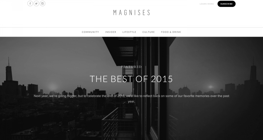
Magnises Website

Magnises is a credit card company that offers unique perks to its members including exclusive events and entertainment.

They came to me with a web design ready to go and asked me to scope and build the site. They also asked me to offer any insight into the existing design and work with their graphic designed to improve it to this degree.

The Brief

Magnises challenged me to bring both its publishing and reader experiences to the next level. My goal was to blend publishing autonomy and extendability whilst ultimately providing the reader an optimal experience for engagement and exploration.

My Approach

I knew from the start that simplicity was the key to this project and the design reflected this view. Infinite scrolling single-column content would allow users to focus while social media embeds would break up the stream. Whitespace was to be a close ally.

The Process

The Magnises user experience needed to focus on content and imagery without drawing attention or distracting the reader with extraneous details. Black, white, and charcoal were chosen to be the primary color pallet while a bright golden yellow acted as a rare call to action highlight.

To further the focus on content, a single clean column would allow the reader to digest one row at a time. A fixed sidebar widget coupled with a contracting sticky header stayed out of sight, but always accessible for the reader.

magnises-staging-mockups

Endless Content

Pagination and the page load time that accompanied it were replaced with a superior user engagement technology: infinite scroll.

magnises-endless-content

Social Integrations

Showcasing the activity of Magnises’ social media accounts was vital to accurately portraying the brand. I utilized the APIs of both Instagram and Twitter in order to display a custom styled embed that would operate with our Infinite Scrolling mechanism.

magnises-staging-mockup-imac

One Size Does Not Fit All

I wanted to serve visitor intent without sacrificing white space or distracting the reader. I designed the website’s header to display differently based on which page the visitor was on and to change on scroll.

magnises-staging-mockups-2

All in all, the project was completed ahead of schedule and to the delight of the client.

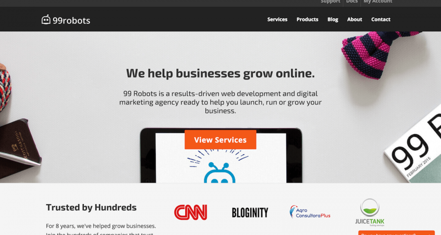
99 Robots – Website Development

As the lead web developer for the 99 Robots website, I was in charge of end to end delivery of every section of the site and their functionality, including but not limited to: